
Colour and Emotion in Promotional Advertising
Colour and Emotion in Promotional Advertising affects us all. Every colour creates an emotional reaction in people. In design and in choosing promotional products we use colour to help guide emotion and give people an immediate feeling the first time they interact with something. In the design world, colours are purposely selected to meet a bigger goal. What is it that are we trying to say about a company, a product or a brand? Certain colours can attract attention and can convey the feeling of the company and it’s branding without even having to say a word. Examples are McDonalds, Nike, Apple, Microsoft – just a few of the companies that don’t need words – just icons and colours.
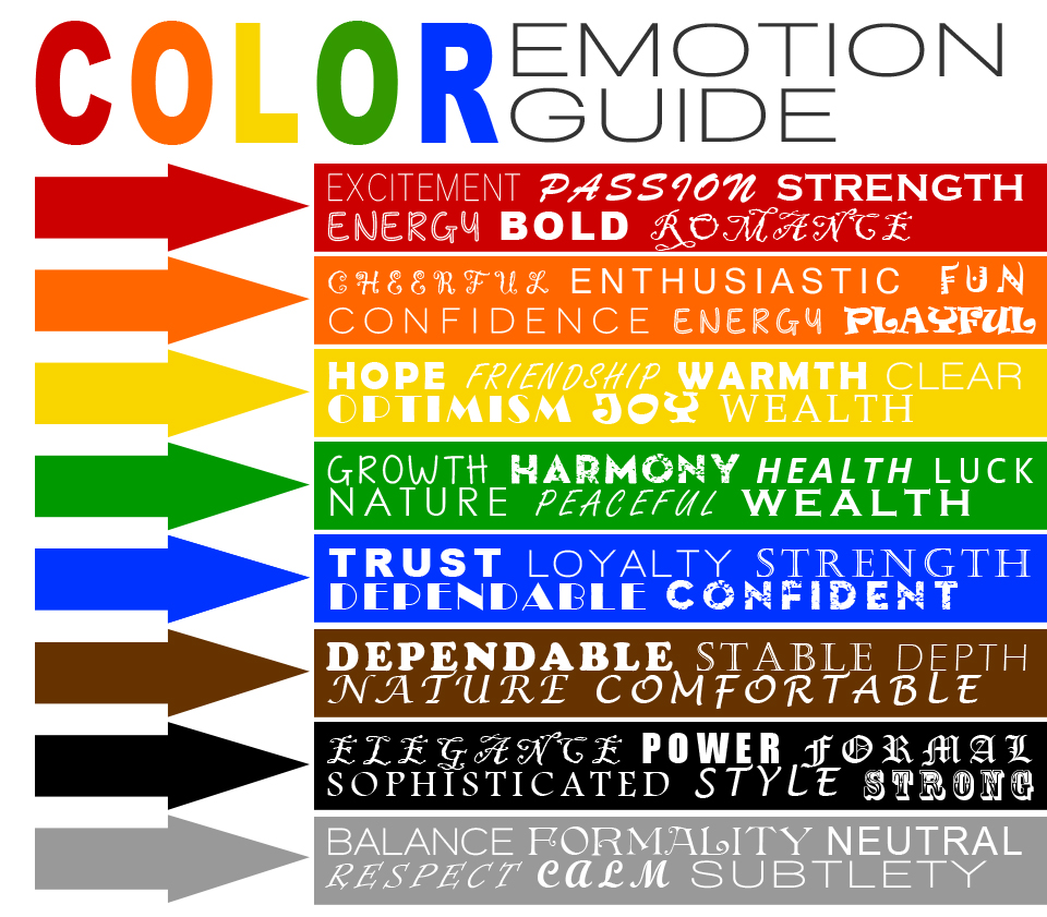
These are the common patterns with regard to colours and emotions that have been identified as to how people perceive colours and what impact this has when customers are purchasing products. There’s no doubt that colours have a big impact on the end result – so next time you are purchasing your promotional product it would wise to think about what product colour would be best to truly represent your company or brand in the most accurate and appealing way.
Examples of colour meanings:-
- RED * energetic, attention-grabbing, exciting and aggressive
- YELLOW * cheerful, friendly, positive and energetic
- ORANGE * fun, playful, childlike, happy, energetic, modern
- BLUE * reliable, secure, trustworthy
- GREEN * trustworthy, refreshing, restful, soothing
- BROWN * stable, secure, durable
- BEIGE * durable, classic, neutral
- BURGUNDY * elegant, expensive
- PINK * romantic, soft, tender
- PURPLE * mysterious, sensual, regal
- LAVENDER * nostaligic, delicate
- GREY * classic, timeless, soothing
- WHITE * innocent, simple, clean, sterile
- BLACK * classic, elegant, serious, bold, powerful
Good advice to keep in mind when consideration your next range of promotional products.